Summary
Dense business plans lose investors instantly. When venture capitalists spend just ninety seconds reviewing each submission, walls of text guarantee rejection while strategic infographics capture attention. Smart founders know exactly which sections need visual treatment and which require detailed prose.
Key Takeaways
- •Picture business plans work best for data-heavy businesses and visual learners
- •Keep text under 30% of your total space for biggest impact
- •Use the 5-second rule: key points should be clear in 5 seconds
- •Free tools like Canva can make expert-looking business plan pictures
- •Mix visuals with enough text to tell your complete business story
- •Test your picture plan with potential backers before final talks
What Is an Infographic Business Plan?
An infographic business plan mixes pictures with key business info. It's a way to share info that's striking and visual.
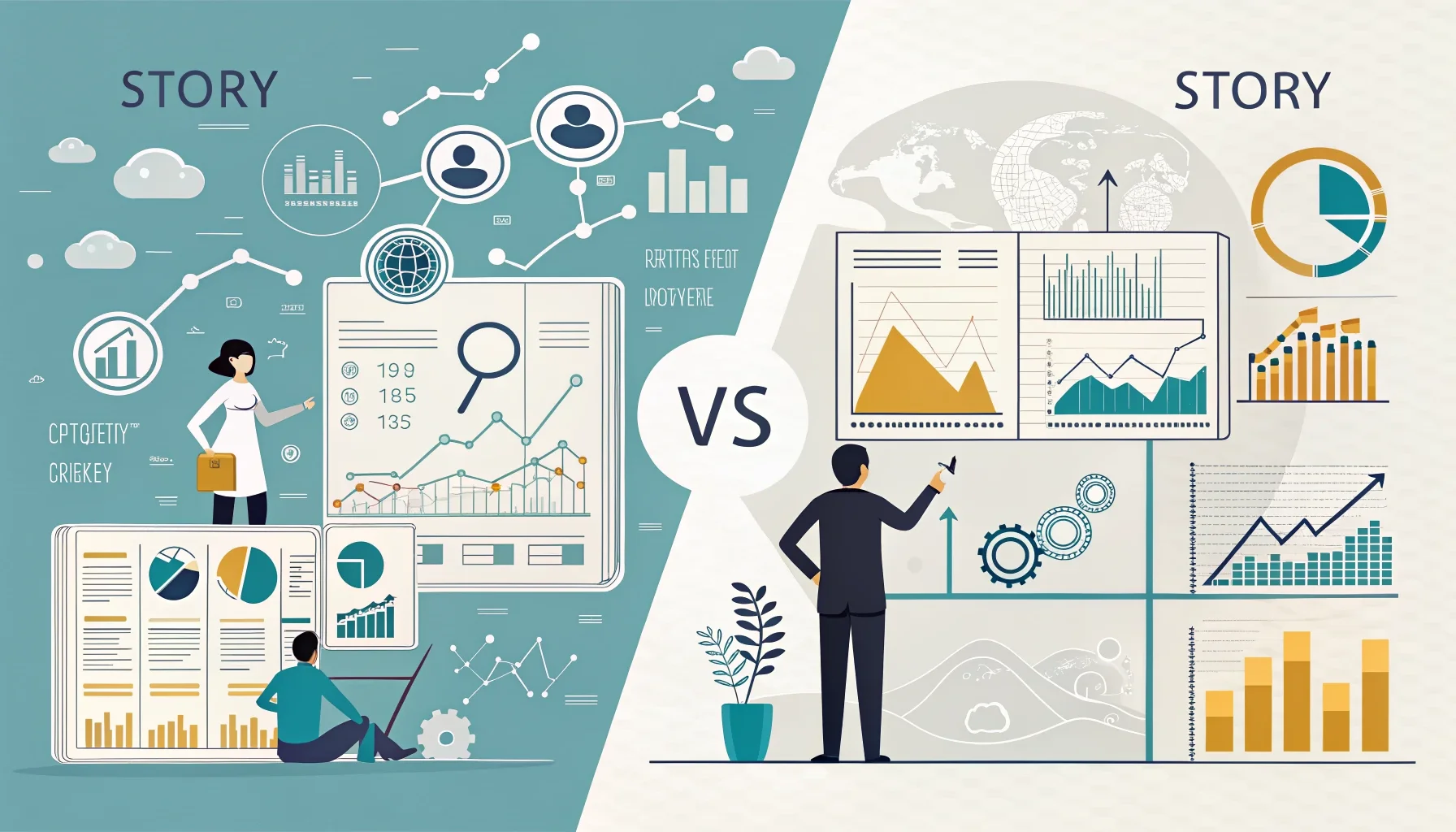
Visual vs Regular Format
Regular plans use mostly text and tables. They can be 20-40 pages long. Busy backers often skip through them fast.
Picture business plans flip this around. They use charts and icons to tell your story. Key numbers jump off the page. Your business model becomes easy to get at a glance.
Think of it as your elevator pitch in picture form. Every part serves a purpose. Nothing gets lost in long blocks of text. So why does this matter for your infographic business plan?
When Pictures Beat Words
Visual formats work best for certain types of businesses. Tech startups with lots of data benefit most. So do companies with clear customer paths.
They're also perfect when you're talking to visual learners. Some backers process pictures faster than text. With 73% of small businesses now having websites, visual sharing skills matter more than ever.
But should you force it? Service businesses with simple models might not need fancy graphics. Know your audience and your story first.
Getting Started with Your Infographic Business Plan
Creating your first infographic business plan can feel overwhelming. But the basic building blocks are simple. You need a clear story flow, key data points, and good design choices.
Start by mapping out your regular business plan sections. Then pick which ones work better as pictures. Your market size fits well in a chart. Your team works great with photos and short bios.
The infographic business plan format lets you control how backers move through your story. Unlike text plans, you guide their eyes exactly where you want them to go.
How Much Text Should Your Picture Business Plan Have?
The right mix of text and visuals makes or breaks your plan. Too much text beats the purpose. Too little leaves backers confused.
The 70-30 Rule
Aim for 70% pictures and 30% text max. This gives you enough words to explain key points. But it keeps focus on your visual story.
Your text should help the visuals, not fight with them. Use short phrases instead of full sentences when you can. Bullet points work better than big blocks.
Count letters, not just words. Long tech terms eat up space fast. Keep language simple and clear. What happens if you go overboard with text?
Must-Have Text Parts
Some info needs words no matter what. Your company name and tagline are clear picks. Contact info is key for follow-up.
Money estimates need context beyond just numbers. A simple "Year 1 income: $100K" tells the story better than a lone number. Key assumptions should get brief explanations too.
Your team bios need text, but keep them to 1-2 sentences each. Focus on relevant experience and unique skills that matter to backers. This is where smart infographic business plan plan pays off.
What Are the 5 Core Parts Every Picture Business Plan Needs?
Every winning picture business plan has five key parts. These parts work together to tell your complete business story with visuals.
Problem and Solution Pictures
Start with a clear problem statement. Use icons or simple graphics to show the pain point. Make it relatable and specific.
Then show your solution right next to it. This creates a visual before-and-after story. Backers should see the connection right away.
Don't make them guess how you solve the problem. The link between problem and solution should be crystal clear in your design.
Market Size and Money Predictions
Numbers tell your growth story. Use charts and graphs to show market chance. Bar charts work well for income estimates. Pie charts can show market share goals.
Remember that 22% of business owners see rising costs as their main worry. How can you address cost management in your financial visuals?
Keep estimates realistic and easy to read. Use consistent colors and clear labels. Your financial story should build confidence, not confusion.
Team Setup and Timeline
Show who's on your team with photos and brief titles. Organize them in a clear hierarchy. Highlight key skills that match your business needs.
Create a visual timeline for major milestones. Use a horizontal flow or roadmap style. Include funding rounds, product launches, and growth targets.
This shows backers you have both the people and the plan to succeed. It proves you've thought through the execution details.
Why Do Pictures Speak Louder Than 1000 Words in Business Plans?
The human brain processes visual info much faster than text. This science fact gives picture business plans a real advantage with busy backers.
How Your Brain Works
Your brain can process visual info in milliseconds. Reading and understanding text takes much longer. When backers have dozens of plans to review, speed matters.
Pictures also stick in memory longer than words alone. A strong visual business plan stays with backers after they close the file. This memory advantage can help during funding decisions.
Complex relationships become clearer through diagrams. Customer flows, supply chains, and business models make more sense as pictures than paragraphs. But how do you capture their attention in the first place?
Attention and Interest
A story forms the backbone of any winning infographic. Visual elements help tell that story in ways that grab attention.
Color, layout, and images guide the reader's eye. You control what they see first and how they move through your info. Text-heavy plans leave this flow to chance.
Engaged backers ask better questions. They remember more details from your presentation. This leads to more productive follow-up meetings.
Real Example: Tech Startup Success
This example is for illustration and based on combined data patterns from multiple sources.
The Challenge
A founder wanted to build an AI customer service platform. The technology was complex and hard to explain in text. Traditional business plans confused potential backers.
The founder knew that 53% of small businesses now use AI-powered chatbots. This trend supported the market chance.
But explaining how the AI worked and why it was better required visual demonstration. Words alone couldn't capture the user experience. How could visuals solve this problem?
The Visual Answer
The founder created a picture business plan showing the customer journey. It started with a frustrated customer and ended with a happy one. The AI's role was clear at each step.
Financial estimates used simple bar charts. Market size became a visual comparison to current solutions. The team section included photos and specific AI expertise for each member.
The timeline showed product development phases with clear milestones. Backers could see exactly when income would start and how it would grow.
The Results
backer meetings ran smoother because everyone understood the concept quickly. Questions focused on execution rather than explanation. The visual format sparked more engagement and follow-up interest.
Note: This is a combined example created for illustration purposes. Does not represent a single real person or company.
What Tools Can You Use to Create Your Picture Business Plan in 2026?
You don't need expensive design software to create expert picture business plans. Several tools offer templates and features made exactly for business planning.
Free Design Tools
Canva offers business plan templates that you can customize. The drag-and-drop interface makes it easy for non-designers. You'll find charts, icons, and layouts designed for business use.
Google Slides works well for simple visual layouts. It's free and teamwork-friendly. Team members can edit and comment in real-time.
GIMP gives more advanced design features at no cost. It has a steeper learning curve but offers expert-level control over your design. Which option fits your skill level best?
Paid Pro Options
Adobe Creative Suite gives you complete design control. Illustrator handles vector graphics perfectly. Photoshop works for image editing and layouts.
Figma combines design and teamwork features. Multiple team members can work on the same file. It's browser-based, so no software installation required.
Piktochart focuses exactly on infographic creation. It offers business-oriented templates and makes data visualization simple.
Getting Started Steps
Start with your key message and main data points. Choose 3-5 core elements to highlight visually. Don't try to include everything from a traditional plan.
Pick colors that match your brand and stick with them. Use no more than 3-4 colors total. Test your design on different screen sizes before finalizing.
Get feedback from people outside your industry. If they can't understand your business model in 30 seconds, simplify the design. This testing process will make your infographic business plan much stronger.
Common Mistakes That Kill Your Infographic Business Plan
Even the best infographic business plan can fail if you make these common mistakes. Learn what to avoid before you start designing.
Design Mistakes to Avoid
Too much info crowds your design and confuses readers. Stick to your most important points. Save detailed data for follow-up meetings.
Wrong colors can hurt your message. Avoid using red for positive growth or green for problems. Keep color meanings consistent throughout your plan.
Tiny text defeats the purpose of visual design. If backers need to squint to read something, make it bigger or cut it out completely. Are you making your plan too hard to read?
Knowing When Not to Use Visuals
Some backers still prefer traditional formats. Know your audience before choosing an infographic business plan way. Older, more conservative industries might want detailed text.
Don't skip important legal or financial details just because they're hard to visualize. Find creative ways to include required information without losing your visual appeal.
Always have a backup traditional plan ready. Some situations call for detailed written explanations that pictures can't give.
FAQs
Pros and Cons of Writing a Business Plan
Pros
- ✓Faster backer understanding of complex business models
- ✓Higher interest rates compared to text-heavy plans
- ✓Better memory of key info by viewers
- ✓Expert appearance that stands out from regular formats
- ✓Easier to present and discuss in meetings
- ✓Can be shared well on digital platforms and social media
Cons
- ✗May oversimplify complex business details
- ✗Requires design skills or more budget for expert help
- ✗Not suitable for all types of businesses or backers
- ✗Can be time-consuming to create and update
- ✗May lack the depth that some backers expect
- ✗Difficult to include detailed money models and assumptions
Conclusion
An infographic business plan can be your secret weapon in 2026. It helps backers understand your idea quickly. They remember it longer too. Start simple with free tools like Canva. Pick your best data points first. Test your design with real people before you pitch. Even the best visual plan needs some text to tell the full story. Your business deserves a plan that shows its potential. Make yours as compelling as your vision.

